Visual identity
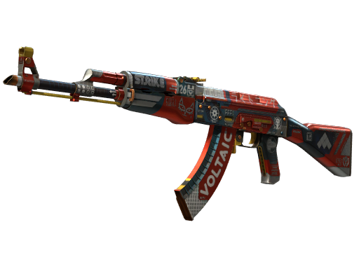
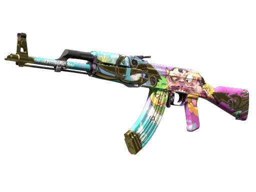
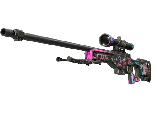
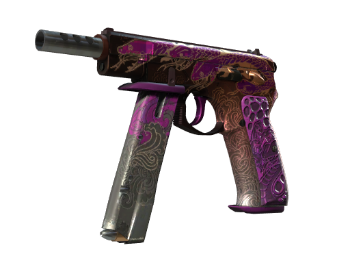
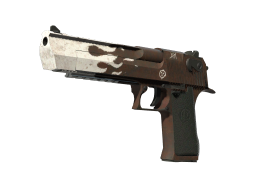
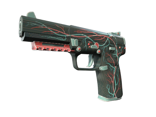
The Bloodsport layers racing-style labels, white typography, and dark details over a strong red base. The dense graphic treatment gives it a sharper, busier character than the Redline.
CS2 Labs field notes
Reviewed 2026-08-30
The Bloodsport layers racing-style labels, white typography, and dark details over a strong red base. The dense graphic treatment gives it a sharper, busier character than the Redline.
It suits a red loadout that needs its rifle to be the statement piece. Keep stickers selective: the finish already contains many small marks, so extra logos can quickly reduce readability.
Inspect the magazine, handguard, and small printed elements. The question is not only how much wear is visible, but whether the fine graphics that distinguish Bloodsport remain clear.
These notes are based on a manual review of the catalog render and how the finish reads inside a complete loadout. They are editorial guidance, not a valuation. Compare the live wear rows below and inspect the exact marketplace item before buying.